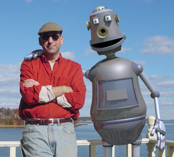
My first post in six months, as I've largely abandoned this blog and been making web pages that i post on my website to track my progress. Regardless, i'll try to fill in the gaps with some links here.
Here's a page that shows the work i did over the spring.
http://computerputty.com//G3_proj_jpgs/dp_spring_proj08.html
In there somewhere should be a link to some hybrid characters I made with stock photos.
http://www.computerputty.com/humanimal_lightbox/humanimal_gallery.html
here's the same stuff in a different layout
http://www.computerputty.com/humanimal_jpgs/humanimal_master.htm
This summer was a tough and largely uninspired summer. My advisor tried to help by suggesting I explore all manner of different things, and when she asked for a tape of my "ponderings" I made the following using screen recording software. (I think i've pretty much abandoned all the things in this recording)
http://www.computerputty.com/wip_video_web/dp_wip_video.html
I also did a whacky, sort of "stream of conscious" exercise to share my interests in micro-organisms and microscopic forms with my advisor, which turned into this web page
http://computerputty.com/microbe_nano_folder/micro_organisms.html
I've also written some fairly whacky stuff, such as this helpful guide to home heating for cold new englanders.
http://computerputty.com/microbe_nano_folder/composting.html
[ I've also written stories on robot abuse in the MIT labs (a fictitious bit of blather based on some photos I found on msn) and a couple of other pieces based on photos, which i wrote at the suggestion of my advisor. Will post them if i can find the pdfs and get them online. ]
Thankfully, i was encouraged to revisit computer machined forms, which is something i'm pretty interested in, so I've been making mockups of diffrent installation and scuplture pieces I might do.
Fall overview - This is text from a web page that links to other work:
This is a page that has some sculpture and installation mockups, some of which I hope to realize by january’s residency.
As I start to think about my thesis I began to revisit papers, books and work by artists that I like. This represents just a small handful, as I must have somewhere near 10,000 images that I’ve downloaded since starting this program. At any rate, these are artists that are currently influencing me (this week… they may be dead to me next week)
I’m currently very motivated and inspired with the idea of some combination of sculpture, computer milled forms, doll sized figures, etc… to make some installation pieces. I’ve been having trouble being inspired by still image work and I think my decades of 3d computer experience has me wanting to make work that comes off the wall, or out of the floor, etc… so am pretty invigorated about pursuing some of my current ideas.
[It was really exciting for me to make my first computer milled piece about a year ago, and thanks to your input I’m revisiting this stuff, and have added the notion of a larger scale for machined pieces, which brings in more problems and research, but more exciting pieces as well.]
As I look into clay sculpture, armatures for figures, milling parts from computer files, etc… I’m trying to organize my project ideas and see I can execute a few of them in the next couple of months, and also to look at how they might fit into a thesis down the road.
I’ve tried to organize my various thoughts and efforts into a sensible collection of web pages, which I’ll share with you below.
MOCKUPS
Here’s a link to some the mockups I mentioned that I’d be working on, which are just low res 3d images of what I hope to make as Sculpture/Installation pieces. (I think i should be able to realize at least two or three of these) Regardless, I’d be happy to hear any feedback on these ideas.
http://computerputty.com/scuplture_web_FF/sculpture_MOCKUPS/dp_sculpture_mockups.html
ARTIST REFERENCES
As I look towards making a thesis outline and abstract I started to put together a collection of works that I’ve recently been inspired by, and this is a collection of images by artists I’ve been looking into. (this page may take a minute to load – 20 to 30 images)
http://computerputty.com/scuplture_web_FF/dp_thesis_artref_ff/artistpix_sm/dp-artist-ref.html
THESIS MAP
This is simply a basic chart that tries to list some of the bigger issues I should be considering at the outset, in hopes of pulling a thesis topic out of it. Please take a look and let me know if you have any suggestions or thoughts on this.
http://computerputty.com/scuplture_web_FF/thesis_map.html
PROJECT OVERVIEW PAGE
I initially intended to reference all of the above via an overview, but am putting this last simply because I don’t want to take too much of your time, but it’s basically an overview of what I’ve been working on recently.
http://computerputty.com/scuplture_web_FF/dp_sclpture_ovw.html
Wednesday, October 29, 2008
Monday, March 10, 2008
March 2008 entry
Dear artist blog,
I am so sorry I haven’t written recently, but have been insanely busy and barely crawling through my weeks. But, I have been thinking of you and have wanted to update you on numerous things:
- The winter residency – This was a great experience for me. I’d brought tons of stuff to show (3 scupltures, 30 print pieces, wooden board collage pieces and I even did a realtime interactive animation performance) so I think I properly embraced the “experimentation” part of my first six months. The crit sessions were by and large helpful, as we all want input to help us figure out what we’re doing or where to go next. It is an exhausting ten days, however, and I landed back in Maine with a cold and an immediate start to teaching four college courses (three of which I’ve never taught before, so a huge ongoing burden to learn and teach some new things this semester). Anyway, I came away from the residency with some pretty strong realizations or impressions, the most memorable being:
- Clarity in imagery is probably a good thing to lean towards at this point, as there are so many images created in these residencies and the question “why did you make this?” will often come up when considering a flat or nondescript image.
- Directed photography, which I had heretofore snubbed my nose at, seems to be something that can really help my work, and I’ve enjoyed the process of opening my mind to the notion and exploring it.
- Truth in photography – There are a number of sources from all areas of the media that are beginning to state the equivalent of the message “There is no truth in photography anymore”. Due to the digital age of photography and the ubiquitous use of programs like photoshop to manipulate photographic images, the world seems to be looking at photography with a mistrusting eye. That’s fine with me, as I have no desire to worry about the truthfulness of imagery, since a portion of all my work is fabricated in 3d graphics software. Nonetheless, it plays into my work as I now plan to push the limits of what can be done with digital imagery, digital photography and photo editing to enhance and clarify the images I create.
- Image appropriation – We had a big lecture on using appropriated images and de-skilling our work, and while I don’t think it was intended as a message that we must do these things it did spawn a desire to do some tests with appropriated images, which has turned into my first project.
- Meaning, message & narrative: At one point I was asked (in reference to one of my architectural images) “What are you trying to say with this image”. I was happy to reply, “Absolutely nothing!”, which is the honest truth. It is just now that I’m getting to the point where I might want to tell a story with an image, or to have it make some kind of statement or give a particular impression. As this has not been an objective of mine previously, I’m hoping I’ll come up with some interesting images.
• Project work
As I begin my project work I’m also reading a variety of books that relate in various ways to the work I’ll be doing. My core mission this semester is to develop a sense of character and narrative with my still image work. While this will have me looking into aspects of storytelling, it also involves exploring the relationship between technology and culture (which will help with any work that involves putting things like robots into photos). I’m also determined to get a better grip on some of the technical processes and tools that I use, so have been looking into matte painting, hdr photography and new editing and creation techniques with photoshop. [I also need to study basic photography as I want to do some very specfic photo work and am still a beginner with all things that relate to exposures and f-stops and the like, so I’m doing lots of camera tests to this end.]
My R&D list for trying to flesh out my tool kit is something like this:
-Matte painting and 3d camera projections
-Hdr photography and adaptive contrast enhancement
-Photoshop techniques for digital environments (clouds and lighting effects)
-3d techniques for terrain generation for landscape imagery
-Digital photo techniques for panoramas
-Photo lighting and shooting techniques
• Works in progress
Photo tests – I’ve gotten a new digital slr camera and need to find ways to get more specific control over my photographic images. I’m hoping to do both exterior work (directed scenes and panoramas) and interior setups, so practicing lighting and using the different camera modes and features is part of my self-directed education this semester.
Here’s a link to a web page with some basic camera tests, most of which use the camera raw format to get more color and dynamic range in images.
[click on the image above to open web page with camera tests]
• Digital clouds and terrains – I’ve also been looking into ways to fabricate skys and landscapes, so have done some initial tests with painting digital clouds and making digital terrain.
• Hostage Exchange – That’s the title I’ve given the image below. I made the image because it boils down the two things I’m always wanting to work on with my imagery: organic forms and mechanic or technical forms. So, I simply thought that some organic tendrils holding a cube, juxtaposed with a mechanical claw holding an organic form might make an interesting image, and when I finished I realized it gave me the impression of an exchange of captured forms, hence the title.
• Project rationale
I am going to try and approach a handful of new things this semester; paramount in this list are character development and narrative, specifically as relates to still image work. I also need to get better at digital photography, so am studying photographers and photography and doing tons of camera tests. And I’d like to somehow combine landscapes, panoramas and narrative, so will be trying a few panoramic scenes that are both photo-based and created with cg tools.
From a content and art point of view I am looking at a few different influences. As I do want to have strong, clear imagery I’m looking at directed photography and lighting to heighten the impact of my photographic elements. Gregory Crewdson is a good example, as he’ll use a Hollywood style film crew approach to lighting and prepping his scenes before he shoots, ultimately giving himself completely control over the makeup of his image. So, I will be scouting locations, getting models arranged, using props, looking at wardrobe and lighting and will hopefully get some good predictable imagery. Ultimately, the work of Charlie White is the closest to what I'm attempting, as he uses special effects and props to stick in his images to create a sense of the bizarre. I'm also looking at other photographers work (Paolo Ventura, Julie Blackmon, Teun Hocks, etc...) and paintings by a variety of artists (Rembrandt, Norman Rockwell, etc..) for image reference as I try to plot out my image projects.
• 1st Project - Human-Animal Hybrids
Humanimal gallery – This is my first finished body of work, and is basically a series of character photos created from a huge stock photo database. I have some rationale up on the web page, which include the notions of developing visual characters as well as written texts about them, and also addresses the use of image appropriation in this project.
There are two different web pages that showcase this work in slightly different ways (this is simply an exercise in presenting the work differently via projects and exercises I've developed while teaching a Web Art class at the University of Maine this semester.
Clicking on the image above will bring up a lightbox interface for viewing this project
Clicking on the image above will bring up a traditional web page gallery
• Approaching the real
I think my current influences have me wanting to create images that are mostly realistic, but somehow not quite real. With good lighting, directed scenes and 3d graphics thrown in I’m hoping it’ll be strong imagery with a sense of the photoreal, but not the sense of a straight photograph. Still don’t quite know how to put it into words but hopefully I’ll be able to do that better as I start to realize some of the images.
Lastly, I think I need to create a project website that shows the setups and objectives for some of my photo shoots. I’ll be begging for lots of free help from photographers, models, stores that can provide locations, etc.. So I think it’s a good idea to be able to send some of these people an overview of what’s involved for a given shoot, simply because there are so many resources (people, props, lights) to coordinate. Must get on that soon. Spring is coming and we’ll be able to leave our igloos soon and go out and hunt for bear.
Tuesday, December 25, 2007
DECEMBER UPDATE
The last month or so has had me finishing a lot of projects, experimenting with a lot of images, failing on many attempts, and generally trying to wind down my semester’s work. I had my last trip to visit William Wegman in NY city, with each successive trip being more rewarding than the one before. He has been very helpful and inspiring, with comments on the entire range of things I worked on. I think one of the most rewarding things was to see all of his paintings in progress and to discuss his work on these. Our final meeting included a little discussion on the arc of my semester, with some encouraging words on continuing to explore my desires to do characters, places and stories, and even some suggestions as to how it might work back around to the gallery world at some point. I could not have chosen a nicer person, and he seemed comfortable in giving feedback on the entire range of my work, from performance animation to sculpture, collage and still image work. All in all, a great experience for me.
• Performance Piece The image below is a snapshot from my performance animation software. I’ve managed to get the system running properly and built an interactive character that can be animated in realtime. It’s a lot of technology to wrangle, but I’m able to carry the system into any venue, set it up and route the video and audio signals through a video projector and PA system. I’ve constructed a short piece for the time-based media presentations at our upcoming residency, and hope to engage the crowd in a lively question and answer session.
• Computer Sculptures I finally got the finished computer-based sculptures back and mounted them on stands. This is an interesting and exciting twist to the 3d still image work I’ve done in the past, as the concept of bring my graphic creations off the screen or off the wall is something that I’ve been yearning to explore. Below are snapshots of the two pieces I had machined from plastic, after creating the files on the computer.
•New Illustrative Technique After reading some of the assignments for our upcoming critical theory course I was motivated to explore the creation of a digital technique for creating images that have a traditional chalk and pencil feel to them. I think this type of imagery has always appealed to me, and it simply took some descriptive readings to motivate me to try some of the experiments below.
I also finished up some miscellaneous things that were on my list, such as a scene with robots at a café and a digital lithograph approach to putting 3d buildings in photos.
It’s time to figure out how to pack all this stuff up and start planning on how I’ll present it in my little space at the upcoming residency. I’m looking forward to feedback, good or bad, and am not sure if I want to continue in all these different directions, but I’m glad for the experimentation and following the directive to try working with new and different media.
Tuesday, November 27, 2007
NOVEMBER UPDATE
• MECA Art Auction
I donated a robot photo (picture of a 50 foot robot sitting in a parking lot on the waterfront) to the Maine College of Art auction and went with some friends to see the preview show of all the work. Some stunning work with lots of great landscape paintings of Maine. The most interesting part, which came as a surprise, was as I was strolling by my piece. A man and wife stopped and squinted at my picture, with the husband saying, “This is really amazing. Look at the technique this artist used”, etc… and then a moment later another man dragged his friend over to squint and stare and make the same type of comments. It was a nice way to get some unsolicited comments on my work and to be a fly on the wall for the process.
The auction itself was pretty bizarre, as I didn’t expect the high energy carnival barking of the auctioneer. A blustery and annoying fellow, but he did sell about 100 pieces of art in about an hour and a half, so I guess that system works. Near the end of the auction I saw someone taking my piece off the wall (my piece was part of the silent auction, as they had a total of about 300 pieces and only included 100 in the live auction) and I asked her if she’d bought it. She said she had and apologized for not paying more, but was excited to hang it in her home. She works for a local gallery so may be a good contact to have at some point. The most interesting part of the auction was to read the bios of the artists as their work was being auctioned, as it helped to get a feel for their background and to see where their work has been shown.
• Architectural Series
I have largely finished my series of architectural buildings and composited them into photos of my area. Rather than hack away for hours at incorporating them into this page, I’ll simply provide a link to a quick photo gallery of the images, which I’ve placed on my website.
(click on the image below to open the webpage of architectural images)
• Other Project Work
I’ve also finished a few miscellaneous things:
• Here’s my version of what a tattoo should be.
• This is a picture of Bobo, my new animated character, who I hope to have speaking to the crowd at the AIB residency via a performance animation system I’m building (lot’s of technical nightmares, and the software company is telling me they basically won’t fix the glitches or support their product, which is a bit maddening)
• Here’s a new robot dog, and I’ve been manipulating my 3d images in photoshop to get more of a hand painted feel and when I print it on watercolor paper the effect is fairly pleasing.
• November trip to see Wegman
I showed most of this stuff to Bill Wegman in mid-November. He liked the robot, and he woke up his son (sick in bed with the flu) to have him take a look at my architectural series of images. I was really looking forward to his input on my wooden panels, as this is a very new direction for me. At first he didn't see a point to them and they didn't make sense to him, but as he continued looking I think he saw some of the thematic content and the treatment of the imagery, as said a few of them were beautiful. I asked him to show me his painting studio again, as his paintings that connect postcards images together are truly inspirational, and I think it helped with some of my ruminations about where I'm going with these panels.
• Robot Sculpture
The rationale for this piece is as follows: Based on Rodin’s “The Thinker”, this piece attempts to extend the picture space to include a subject that the character is contemplating. There are a handful of different objects/subjects that the robot might be contemplating. Does it change the viewers’ perception of this tableau if the subject is a flower, or a carved wooden figure, or another mechanical object?
Here's a bad photo of my robot sculpture
• Wooden Panels
I finally managed to get some passable photos of my wooden boards with collages of my images. I’ve spent so much time trying to figure out how to combine all this imagery and now simply need to try and get a concrete starting pile of these that represent the various approaches I’ve used. I'm trying to find a way to combine photos, 3d graphics, line art, and landscapes in a more organic and painterly fashion, so I've manipulated some of my images in photoshop and printed to a variety of different paper types and then collaged them onto wooden boards.... and here are my intial results, although I don't think my photos do them justice. (you can click on a thumbnail image to bring up a larger version in a new window)
• Next
It’s time to work on my video and animation and time based projects. I have a handful of things in mind and need to simply crunch away at them in hopes of finishing the bulk before my next and final visit to see Bill Wegman, and then it’s off the residency a couple of weeks later.
Thursday, October 18, 2007
OCTOBER UPDATE
• Architectural series notes -
After researching classic and modern art, as well as classic and modern architecture I began to create a series of 3d architectural renderings that I composit into photos of my city. I cast the net far and wide as regards the style of buildings, with influences from classical art to surrealism and modern art (De Chirico and Calder, for example) And I reference some modern architects as well (Gehry, Frank Lloyd Wright, etc..) I also used cultural iconography, turning some basic, everyday cultural imagery into buildings.
My objective has been to make buildings that, for any number of reasons, would never be built in the real world. As for context, I tried to make sure that they were able to be melded into a background photo with some degree of comfort, and I’ve had some degree of success with this, I think.
The process has been more daunting than I’d imagined, as there are a lot of scale issues to deal with when sticking false buildings into photos of a metropolitan area, so I probably have as many failures as successes, but I still think it’s a good series of work, which I’ll hack into a gallery of work that I can put online as soon as I’m finished.
( I had to break the law for the sake of art with this project, as I needed shots from a certain distance from my city, and the only good vantage point was the highway that goes through town, so I had a friend be my wheel man as we stopped repeated on a five mile stretch of highway, whereby I would jump out of the car, hop up on the guard rail and snap photos, with all the cars honking as they went by. I’m sure they were just trying to say, “hello”.)
[ Pursuant to this area of study, I went to a Lecture at the local art museum called “Three American Architects: Richardson, Sullivan and Wright”. The speaker was an architectural historian named James F. O’Gorman, and it was a fascinating lecture for a number of reasons. He began by explaining, with a little bit of shrouded animosity, that Frank Lloyd Wright wanted the world to believe that he was simply born a full fledged genius and created all his wondrous things with no influence or input from the outside world whatsoever. O’Gorman seemed to have a need to disprove this claim and went on to show that Wright was indeed influenced by architects like Louis Sullivan and Henry Hudson Richardson. He then presented a number of buildings and details that chronicled the progression of modern architecture over the first half of the twentieth century. Of particular interest were the images of Sullivans terra cotta details that were incredibly organic and ornate, and O’Gorman explained that these designs took from nature (flowers, animals, etc…) but were not expressly images of nature. He quoted Sullivan as saying, “in this type of detail we should create imagery from nature but not of nature”. ] Here's a sample of Sullivan's detail work, and I hope to include this type of work in my imagery somehow.
As for my writing assignments, I think I wrote a fairly salient paper on the influence of surrealism on modern architecture, and can certainly say that all my reading and research on modern art and architecture helped me to visualize the series that I’ve been working on.
A link to a pdf file of the paper is here: ******
• NY Trip
I had my first trip to see William Wegman, and I spent a few hours scouring the Chelsea art gallery scene as well. The galleries were both disappointing and inspiring, with samples of bad, roughshod pencil drawings mixed in with stunning paintings that seemed to redefine the skyline of Manhattan in new ways. Twenty foot tall sculptures, $16,000 paintings; a morass of work that was hard to take in whilst lugging forty pounds of luggage and portfolios. (A lot of bad planning to put myself in the spot of lugging all my stuff around Chelsea for the day, so next time I’ll plan it better)
My visit with Wegman could not have gone better. He was welcoming and accommodating, giving me a tour of his studio, introducing me to the dogs and people there, and showing me all the things he’s working on. I was delighted to see a number of paintings that he has in progress and it’s a great contrast to his photo work. We then sat down to look at my work, which included the work I entered the AIB program with as well as some of the work I’m currently doing. He had good and interesting feedback, suggesting I do a childrens book (this was already in my mind as a project for next semester) and he gave a great reference to Walter Wick’s work. As I explained that I’m likely intended to be a storyteller at the end of the day, and that the animation business may be my only true destiny, we discussed the worlds of art and the film and tv business. (He has his own parallel stories to the foibles of trying to develop properties for film and tv, so it was heartening to hear some confirmation on the processes that I’ve been through in this arena) He is a good and varied person for me to bounce my work off, so I’m really happy that he agreed to mentor me for this semester and look forward to his input and feedback in my coming visits.
• Art with power tools
While I know it’s good that I’m trying things outside my realm of comfort (computer graphics tools) I’m a little daunted by some of the 2d image work, sculpture and other things on my list. In particular, working with power tools to make a four foot robot has been… um, not so much fun. I managed to stick my finger into a band saw, which was almost disastrous. I used the yankee barter system to get some help from my neighbor Rick, who has the tools and knowledge to solve some of the stickier problems with fabricating this robot. Two months of gathering materials and two months of building (a night a week was deemed “robot night” for the past two months) and the robot is all but complete at this point, with a few finishing touches to go. I’ll be posting a photo and some rationale on it soon.
• Epiphany
I have broached yet another uncomfortable, but potentially exciting aspect, of my art. I began experimenting with layered printouts (i.e. – printing on vellum and transparency film and layering those images over background printouts) in mid-summer and while I liked the potential of combining the various imagery it wasn’t clear to me how I could do so in an elegant or sensible fashion. I began to construct lightboxes in my head, with fancy clips and binders to allow viewers to peel back the layers, but it was clearly a convoluted and impractical approach. Still, I wanted to combine various looks of line art, landscape imagery, photography, 3d graphics and painted imagery into one piece, so I doggedly pursued the notion, with little hope of resolving it. I discussed it with my advisor (Deborah Davidson) and William Wegman, but there still didn’t seem to be a clear answer. Somehow, through printing the various bits from my computer, playing with different types of imagery and paper, and discussing it with friends and artists, I arrived at what I think is a solution. When a friend dropped off a wooden painting panel, asking me to make something on it for her birthday, I started thinking of the notion of tearing pieces of printouts into various sizes and decoupaging them onto a wooden board. I think this will allow me to achieve the semi-transparent aspect I’m looking for as well as accommodating the variety of imagery (line art, photo, 3d render, etc…) I’d like to use as source material. Wegmans’ paintings that tie different postcards together helped cement the idea, as did Deborah Davidsons bookmaking class, not to mention about five other little things that all combined to lead me to this approach. I now think I can proceed and realize this (still somewhat nebulous) conceptual approach and create a tangible piece that has some meaning to it. It is still driving me crazy, as I’m not sure how the imagery will ultimately fall together, but I will endeavor to put one example together soon. I’d like it be as palatable as a nice casserole, with a comfortable mix of ingredients, but there are still a couple of conceptual hurdles in my path. Is there a god of the arts? If so, now is likely the time when I would be well advised to sacrifice a goat (or something) to this god.
I must hurry along my path, for winter is on the nigh and I have video and animation and music projects yet to embrace.
More to come soon, as well as new pictures.
Monday, September 3, 2007
SUMMER PROJECT WORK
I’ve put in a lot of intensive studio work this summer and if I can keep up this somewhat maniacal pace I think I can actually finish everything on my overly ambitious list.
This first batch of work is laden with surrealist influences, and I think I just needed to get some of these images out of my system, and while some of them almost killed me in the making of them I’m happy to have them behind me.
**Note: Many of the images below can be clicked on to open a larger version in a new window.
Gull and Robot
This is a continuation of my “robots around town” series, and my ongoing objective with the series is to create a more organic connection between the robots and the background photos I shoot.
SCULPTURE
I have two types of sculpture that I’m working on; forms that are machined from computer files and a robot that will be made from about 50 to 100 different hunks of metal and lamp parts that are all bolted together.
The image below comes from a file that I’ll be using to have a 3d form machined from computer files. As I looked at surrealism and the organic forms involved I found it inspiring to look at the shape of things like feet and hands, and I was compelled to make a sculpture of a pair of flying hands. I'm also planning to make one based on a character who could best be described as one of the feet people. (see feet people image below)
The robot I’m making will be part of a tableau (for lack of a better word) I want him to be in the “thinker” pose, but I also want him to be contemplating something that is the subject of his gaze, which will be a box with a simple item on it, such as a flower. (I like the fact that this sort of extends the notion of the original thinker from Rodin) I think the notion of a machine contemplating something organic is also an interesting idea, and if I can realize this project I think it will make for a nice scene that can be set up. That being said, it’s a daunting amount of work in front of me.
STILL IMAGE WORK
There are a few things at play with my still image work. One is the notion of landscapes; I’m surrounded by beautiful coastal imagery and I continually strive to address organic elements in my 3d graphics, so I’ve got some images whereby I try to address things like clouds, water, rocks, etc… and incorporate them in some of my visual ideas.
I’m particularly struck by dusk, as the colorful skies, the interplay of electric lights with the fading sunlight, the shadows, textures and hues…. All of it presents an artistic challenge. And while I would never call my work “photorealistic” I do think the scene below (entitled “Down on the Docks”) has some nice elements in it, and I’m particularly happy with the painterly quality of the water.
I’m also experiencing a tug towards surrealism, and have been working on a few things that have elements of surrealism in them. The image of the “loper” below is an example. It’s a simple study that tries to address interesting lighting of the cubic form of the room, balanced with the roaming creature within.
Another surrealist influence is the feet people. (I think that just about any organic shape can be fodder for creating a character, and for some reason I saw the foot as a good shape for deriving a characters’ head, and henceforth the feet people were born. ) It was extremely daunting to actually make the image I conjured up in my head of a group of feet people going to church on Sunday. I don’t know where the image came from, but the composition was very clear in my mind and the execution of it presented lots of problems
This image has overt surrealist references to both Dali and Magritte. It also incorporates some of the research for my first paper, which will be comparing and contrasting the influence of surrealism on modern architecture.
As I started to make the image above I was being very receptive to the notion of a dreamlike environment with organic forms that are off kilter or out of context in some way, and simply couldn’t help but include the accountant floating along in his little cloud. I think he represents the fact that we always seem to be chased by some aspects of the world of paperwork; bills, taxes, rent, forms we must fill out, etc… and even in our dreams it’s unlikely that we’ll completely escape this aspect of our lives.
(most of the images above will be printed at 30 to 40 inches wide and I hope the colors come out well and that they have some impact at that size)
NEXT...
Running man building
This is the first in my series of architectural images, whereby I’ll be making some buildings with pop and surrealist influences and sticking them in photos of the surrounding area. I like the fact that this building addresses the concept of “gesture” in architecture, as it’s something I haven’t seen addressed in any of my research, even though I’ve found images of every whacky type of building design imaginable. (more buildings to come as I push forward)
Beyond a series of architectural images I also need to work on animated characters for a couple of animated pieces, and I'm going to try and build a portable (laptop based) system for doing performance animation, whereby one of my characters can talk and interact with an audience.
Not sure if this counts....
We just celebrated my mom's 80th birthday, and we had relatives from China, California, New York, Chicago, etc... all descend on southern Maine for a week of nuttiness. My mom is an interesting critter (one small example is the fact that, having lost the use of one arm to polio in her teens, she started playing one-handed trumpet in her 70's and regularly sits in with my jazz band - we went to a jazz jam last week and had three generations of my family playing on the same song... a public debacle but it made mom very happy) The story below (a mockumentary, I guess) is a 4 minute short film that chronicles her efforts to donate her brain to medical research, and I found it to be such an amusing and anecdotal tale that I couldn't resist retelling it with a little embellishment. It was a great hit at her party but I'm not sure how much others will like it. Nonetheless, a good excercise in doing home-based video production.
This should open a link to the video on youtube
Monday, July 30, 2007
AIB Fall 2007 Studio and Academic work
Below is a summary of the studio projects I’ll be working for this first semester. As regards areas of study, I’ll be researching surrealism, post modern architecture, beat poetry and art criticism, among other topics. I’m hoping to tie surrealism and post modern architecture together in order to support some of the 3d architectural images I’ll be making and inserting into photographs of the area where I live. For animation and video work, I’ll be using beat poetry and art criticism as a means of developing an animated robot character, which I intend to use for animation, video and interactive performance work. As this is the semester in which we’re encouraged to try any and all new mediums we are interested in I’ll also be doing some sculpture and 2d image work.
PROJECT LIST
• SCULPTURE
- “The Contemplator” - robot tableau – This is in some ways my most ambitious project, as it has me fabricating a robot from lamp parts, heating ducts, garden implements and more. I’m happy with the concept for the piece, as I intend it to be a robot who is sitting and contemplating a series of objects, and I’m hoping it will take Rodin’s “thinker” and extend it in ways that will hopefully inspire the viewer to question how this robot might be perceiving some of the objects he is looking at.
- “Flying Hands” - computer fabricated sculpture – I’ll be making a 3d model of a pair of hands that has been crafted into a bird-like flying creature and then having it milled into a physical sculpture via fancy new “3d printing” technology.
- “Foot Person” - computer fabricated sculpture – Using the method described above I’ll also try to realize a character that has a head shaped like a foot. The uniquely organic shape of the foot lends itself well to the studies I’m doing in surrealism and I’m hoping it will be an interesting character study that can work into sculptural and still image pieces.
• 3D STILL IMAGES
- Surrealist architecture series – This will be a series of 3d images of buildings that I’ll design with postmodern art, architecture and surrealist influences. Each building will be integrated into a photo in order to see how these types of structures might be perceived were they to be built and fabricated in the real world.
- Surrealist imagery – I have a few ideas for what I’d consider to be contemporary surrealist images, and I will try to use a variety of surrealist and classical influences to create some images that bring a slightly new and different look and feel to surrealist imagery.
- Robot images – As I’m still sort of finishing up on my robot phase, I’ll be trying to create a few new images that incorporate robots in photos, in hopes of pushing the envelope a little further than my previous “robot photos” series.
• 2D STILL IMAGES
- Architectural composited imagery - layered paper, vellum and transparency piece - I’m experimenting with the notion of translucency and transparency as it applies to building up an image in layers. While I have the some layers of a piece printed, I don’t think it reads well when I try to layer them so I may be building a small lightbox in order to realize this piece.
- Concept sketches – I’m interested in using a pencil sketching technique with the computer, and have downloaded a number of “handwriting fonts” that will hopefully let me create some images that have both a clean, crisp nature and a casual, sketchy look at the same time.
- Photo manipulations with tattooing – I have a couple of ideas for supering tattoos onto photos, as I like the notion of taking something that is so permanent and being able to experiment with it without having to let some guy who rides a Harley drill it into my arm. (I know there is pain in art, but I draw the line at dentist drills)
• VIDEO & ANIMATION
- “How my mom got into Harvard” - Short Film - This is a short film I’ve been wanting to do that slightly embellishes my mothers’ year long (desperate) attempts to donate her brain to medical science, and in particular to the Harvard Medical School, who were not very interested. As we’re celebrating her eightieth birthday this summer with a massive family reunion, I think my family members will be interested in the retelling of this bizarre quest.
- “Paint on Paper” – Animation and Video – This is a continuation of a technical approach I’ve just started experimenting with, whereby I attempt to interact with an animated character that is being superimposed over video. A difficult thing from both a conceptual and technical point of view, the piece will endeavor to show a new robot character (who is both art critic and beat poet) critiquing a new painting I’ve done.
• INTERACTIVE PERFORMANCE
- “Animated Q & A” - I will be attempting to project a realtime animated character on the screen for our time based presentations in January. The character will be able to talk and interact with the audience and will be answering questions from students and faculty.
- “Interactive Jam” - music and animation performance piece – This will entail a trumpet and saxophone musical exchange, whereby I improvise on the trumpet along with an animated character who is playing the saxophone.
** There are other images and ideas floating around in my head, and if I can realize any of these without distracting myself from finishing the primary objectives on my list I may make them as well, be they sculpture, 3d images, 2d images or video and animations.
Subscribe to:
Posts (Atom)